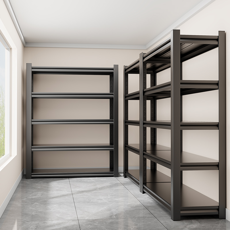
I was trying to buy a simple metal shelf on Taobao.
Nothing special. No design ambition. Just a functional object that needed to hold weight and fit a space. I typed a few keywords and immediately got hundreds of results.
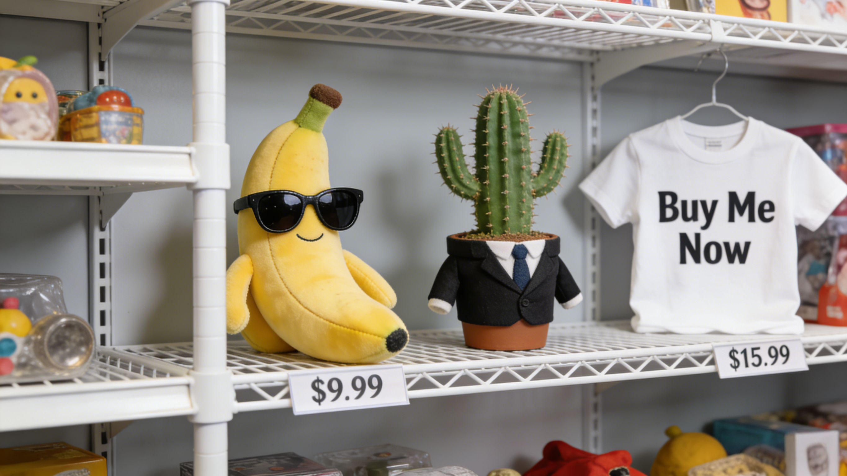
White backgrounds.
Red arrows.
Overlaid text everywhere.
Dimensions circled, highlighted, repeated.
Visually, it was overwhelming — almost aggressively so.
My first reaction was simple:
Why is everything so ugly?
When Visual Clarity Isn’t the Goal
From a traditional design perspective, Taobao product images feel wrong.
They break every rule:
too much information, no hierarchy, no restraint. Compared to minimalist product photography or curated design stores, they feel noisy and unrefined.
But the longer I stayed on the page, the harder it became to dismiss them as bad design.
They were doing something very specific — and doing it consistently.
Using Nanobanana to Look Closer
Instead of trusting my instinct, I took screenshots of dozens of shelf listings and fed them into Nanobanana.
I didn’t ask it to pick the best product.
I asked it to explain what I was seeing.
Nanobanana grouped the images quickly. Not by style, but by structure.
Where information was placed.
How dimensions were emphasized.
Which elements repeated across sellers.
That’s when a pattern became obvious.
These Images Aren’t for Humans First
Most Taobao product images are not optimized for beauty.
They’re optimized for recognition.
High contrast objects.
Clear outlines.
Text placed where it won’t interfere with the object’s silhouette.
They are easy to crop, easy to classify, easy to compare — not just for users, but for systems.
Taobao’s sellers aren’t thinking about AI explicitly. But at scale, behavior adapts. The platform rewards what performs, and what performs gets copied.
Over time, a visual language emerges — not aesthetic, but functional.
Recommendation as a Design Constraint
As I clicked through similar listings, the recommendations became more precise.
Not prettier.
More specific.
Same structure.
Same mounting logic.
Same use case.
The system wasn’t learning my taste.
It was learning my constraints.
The interface feels messy because the filtering happens through interaction, not presentation.
What This Changed in How I Design
After analyzing those images with Nanobanana, I stopped thinking of them as “bad design.”
They are highly intentional — just not in the way designers are trained to value.
They prioritize:
clarity over elegance,
structure over mood,
machine readability over visual calm.
As a creator, that realization stuck with me.
I started asking different questions in my own work:
- What am I optimizing for?
- Who needs to read this — a person, a system, or both?
- Am I designing for taste, or for understanding?
Taobao’s Quiet Foresight
Taobao didn’t set out to design for AI.
It set out to scale.
But scale forces clarity. And clarity, eventually, aligns with how machines see the world.
By the time AI tools like Nanobanana arrived, Taobao’s visual ecosystem was already structured enough to be analyzed, clustered, and understood.
Not because it was beautiful —
but because it was legible.
Seeing Differently
I bought the shelf. It works fine.
But the more lasting takeaway wasn’t the product. It was the reminder that good design isn’t always calm, and usability isn’t always friendly.
Sometimes, design evolves to serve realities we don’t consciously see yet.
Nanobanana helped me notice the pattern.
Taobao provided the evidence.
Between them, I learned to look past surface ugliness — and see structure instead.